Performance is in the heart of any discussions those days. Building amazing and fancy websites is nice, but if half of your users quit because of a lack of performances, it's simply useless.
Since I remake my own website recently, I think it will be a good opportunity to present some methods to quickly improve performances. I choose to split this article into three major tips that will make the difference. To illustrate the evolution, I will use Google PageSpeed Insights. It's not the only tool I use to analyse performances, but the quick notation gives a good insight of the situation.
Before starting
Right after the first release of the website, I didn't make any optimisation. I keep it in mind during all the development process, but normally and for small realisations like this, I do all the performance improvements at the end.
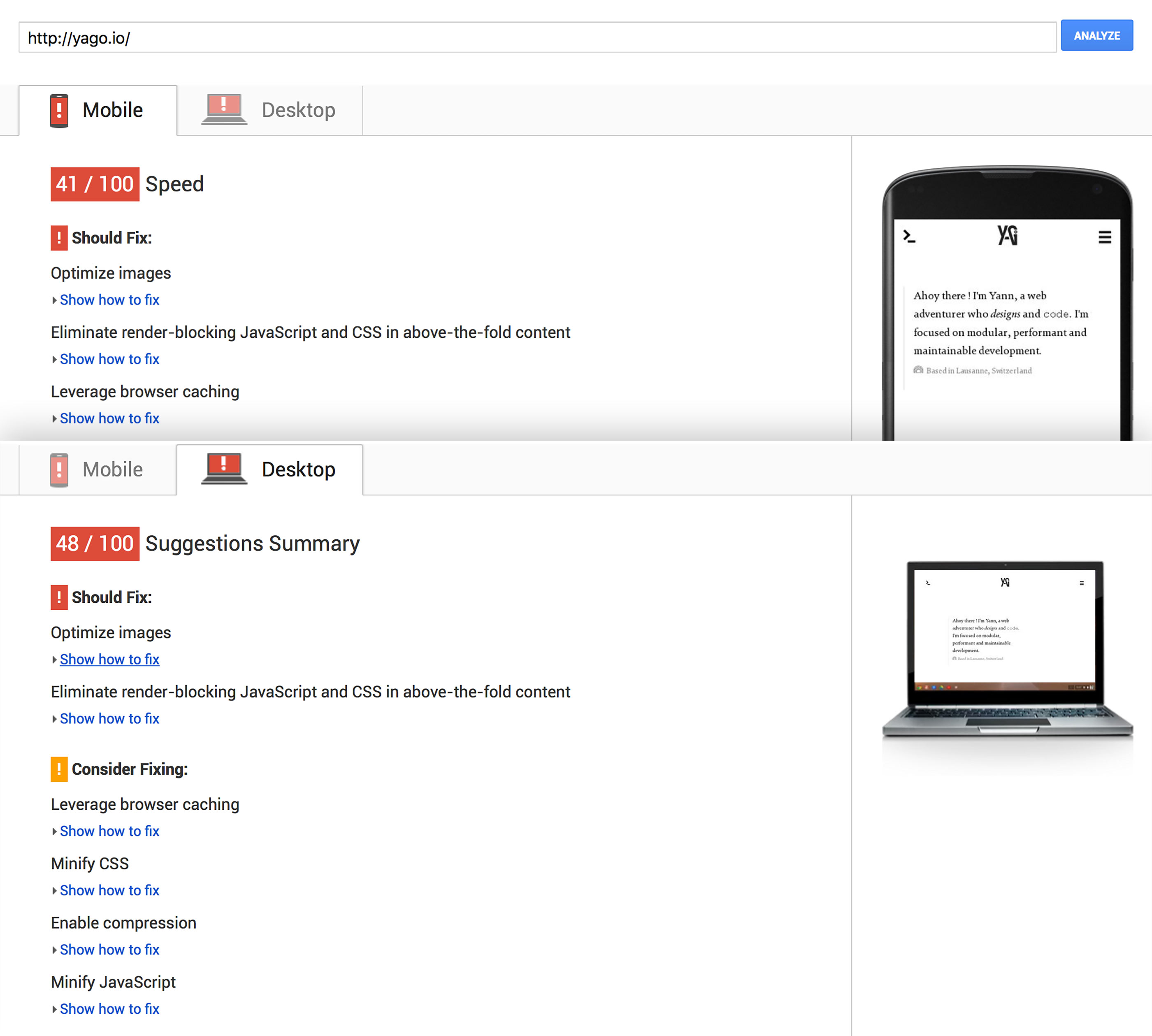
For now, the performances are pretty bad. PageSpeed give me 41/100 on mobiles and 48/100 on desktop. I also take a quick look on WebPageTest and I found that my site takes around 3 seconds to load, which is slow for such a minimalist interface...
Tips 1 : the Picture tag
Like any conscious frontend developer, I properly compress all my images with the finest tools on the market, but sadly (or not), it's not enough. Even if you use a 20% compression and you still serve a 2000px large image to iPhone4 users, they don't going to like you. So, you have to serve various images sizes depending on devices resolutions.
To do it, you can use the <picture> tag and because it syntax is not fully supported, a great polyfill is available.
In your <head> :
<script>
  // Picture element HTML5 shiv
  document.createElement( "picture" );
</script>
<script src="https://cdnjs.cloudflare.com/ajax/libs/picturefill/3.0.2/picturefill.min.js" async></script>
In your page :
<picture>
  <source
    media="(min-width: 62em)"
    srcset="/img/big-img.jpg 1x, /img/big-img@2x.jpg 2x">
  <source
    media="(min-width: 48em)"
    srcset="/img/medium-im.jpg 1x, /img/medium-im@2x.jpg 2x">
  <source srcset="/img/small-img.jpg 1x, /img/small-img@2x.jpg 2x">
  <img src="/img/default-img.jpg">
</picture>
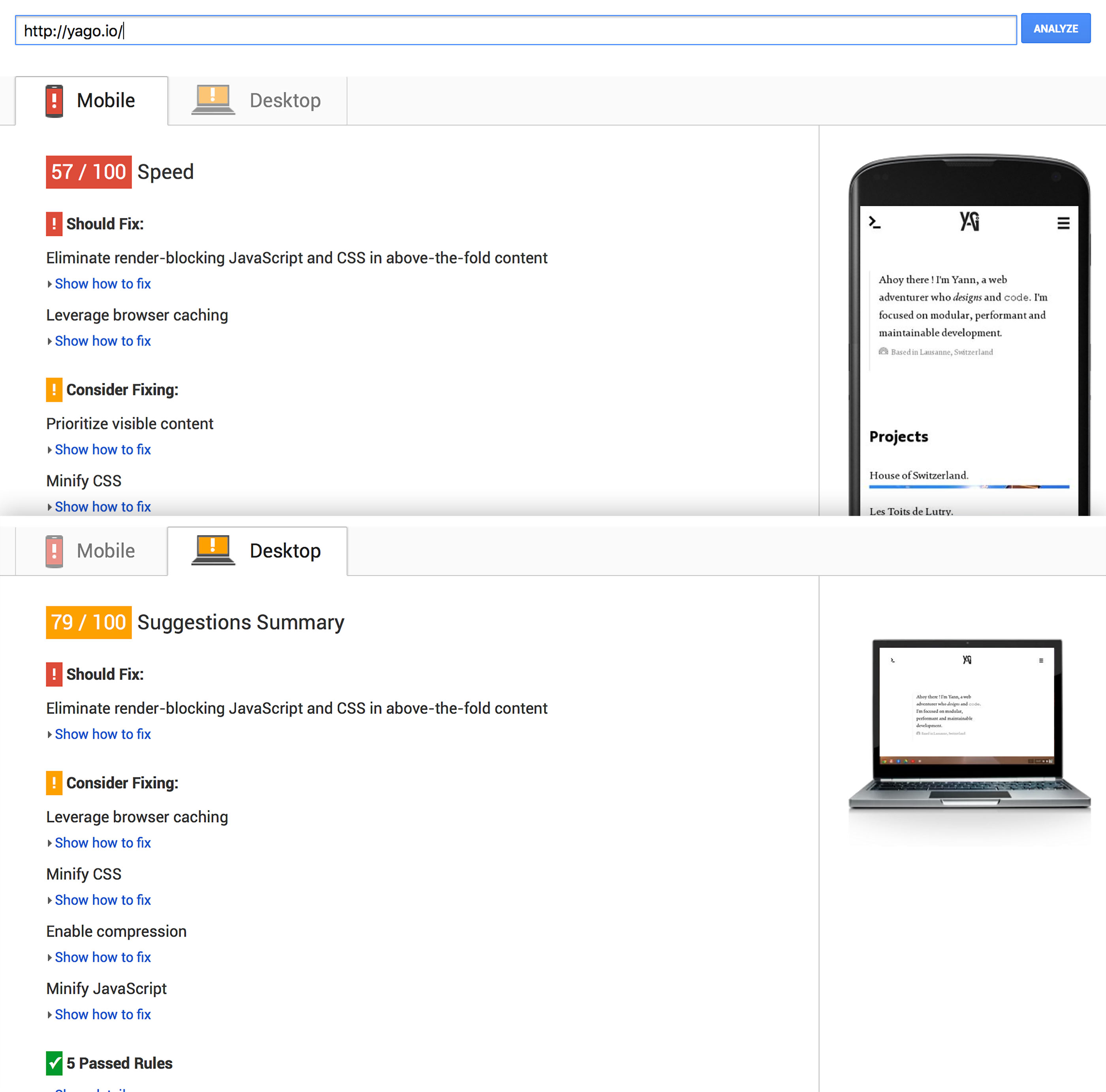
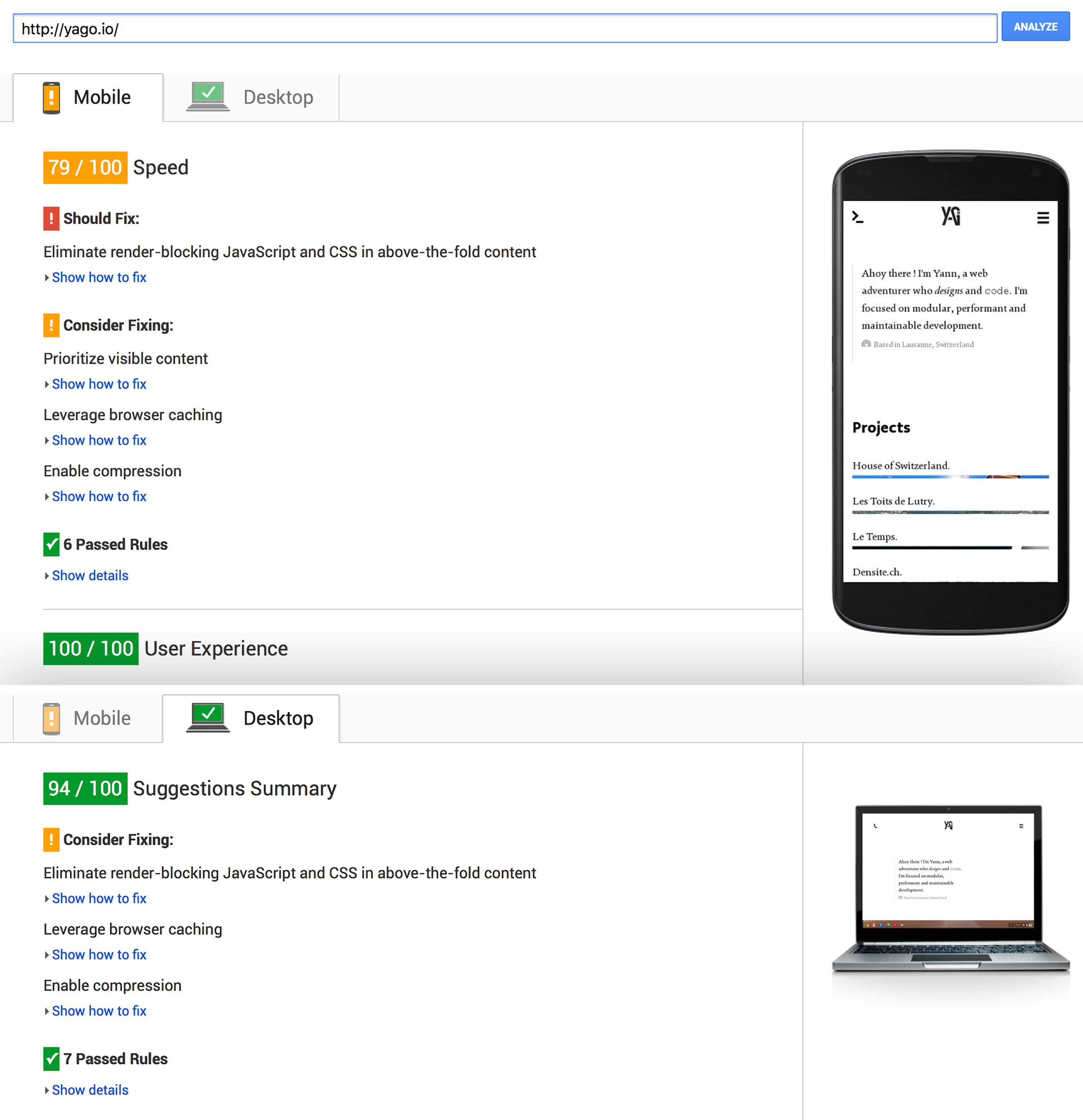
Only with this “small” improvement, I win 600 ms on loading and PageSpeed give me 57/100 on mobiles and 79/100 on desktop which starts to be much better ! Learn more about picture tag on RICG website.
Tips 2 : CSS/JS Optimisation
One of the first advice that gave me PageSpeed is to reduce the amount of render-bocking stylesheets and scripts. Because of my minimalist design, my stylesheets shouldn't be heavy, but I use a custom font… So, I choose to load asynchronously the font file, because it's not essential for rendering the page and because it represents 90% of the total CSS weight of my site. I can do that in many different ways, but I choose the LoadCSS library.
In your <head>
<link rel="preload" href="/css/font.css" as="style" onload="this.rel='stylesheet'">
<noscript><link rel="stylesheet" href="/css/font.css"></noscript>
<script type="text/javascript">
    // LoadCSS script here...
</script>
My other stylesheets are pretty light, so except minification, I don't do anything else. If you have much heavy CSS, you can use the critical CSS approach, which loads critical styles first and non-critical asynchronously.
My scripts are already loaded at the bottom of my footer, but on mobiles, they are considered as render-blocking. I have to load them also asynchronously. For that, I can use the async defer attributes, but they are not well supported. So I choose to use another Filament Group module: LoadJS. I keep the LoadJS code in my <head> and always at the bottom of my <body> :
<script type="text/javascript">
  loadJS("/js/vendors.min.js", function() {
    loadJS("/js/main.js");
  });
</script>
I use the method's fallback to load my vendors first and then, load and execute my scripts.
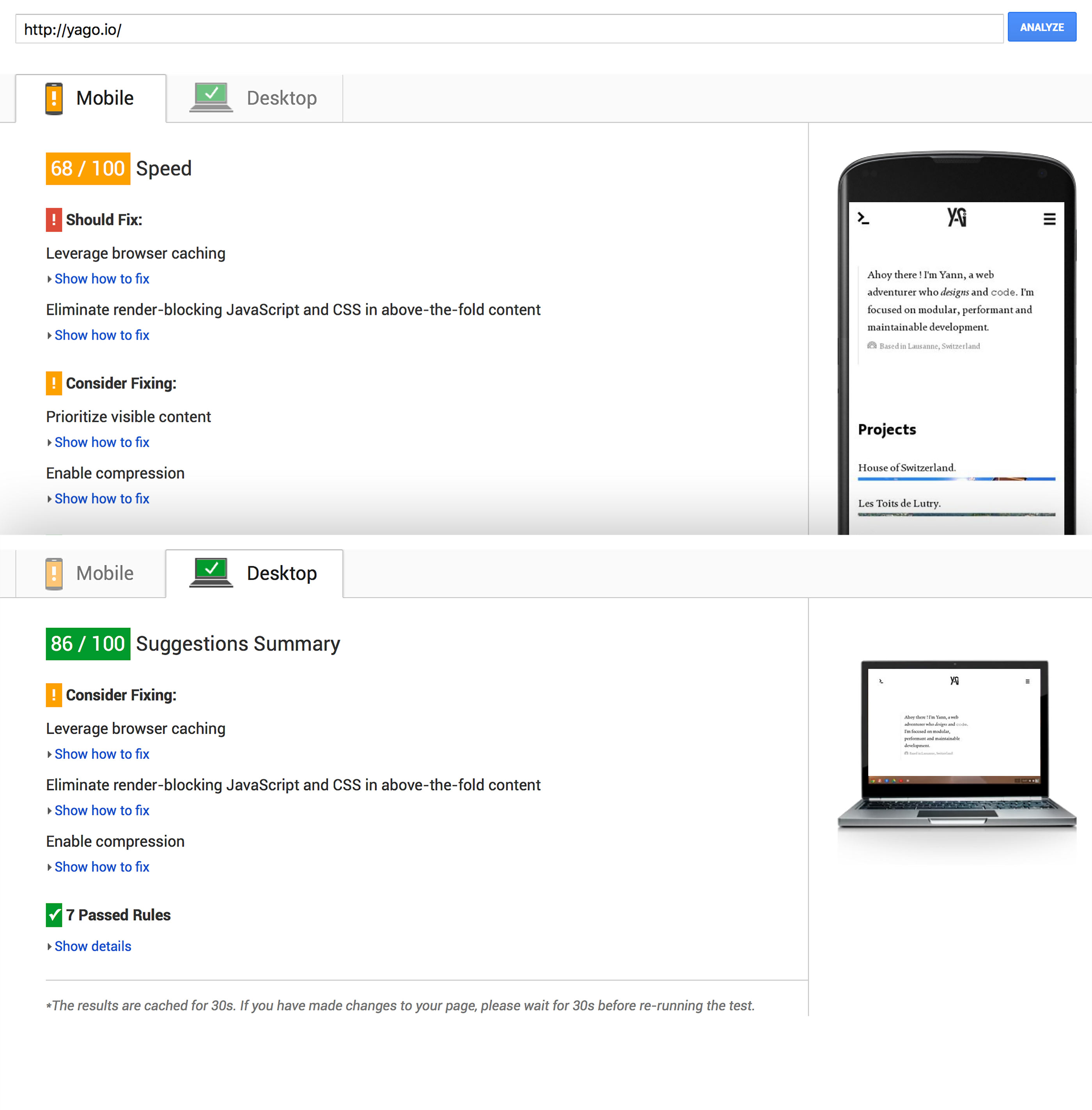
After this step, PageSpeed gave me 68/100 on mobiles and finally a green 86/100 on desktop ! On WebPageTest side, the change is not also impressive, but it is still some milliseconds.
Tips 3 : CDN
Using a CDN is the final step to improve your website's performances. I choose Cloudflare which offers a great free plan, enough for our needs. You just have to create an account, follow the add-a-site steps, redirect your domain's DNS and here you are !
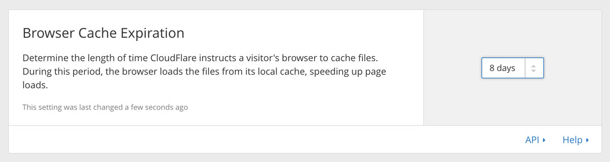
Don't forget to set a Browser Cache Expiration of 8 days or more.
The bonus of using Cloudflare is the HTTPS options. Even if, like me, you host your code on a gh-pages, you can enable SSL encryption between your users and Github. It is pretty interesting knowing that Google is more and more focused on encryption for each result.
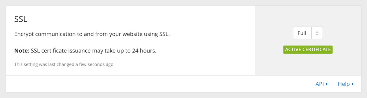
Before relaunching all my magic analysis tools, I have to wait 24 hours to see the first CDN effects. Finally, my site takes 2.2s to be fully loaded and PageSpeed gave me a 79/100 on mobiles and 94/100 for desktop.
Conclusion
I don't reach on 99/100 on PageSpeed, but we can see that with this only three tips I'm not far from it. There is many other ways to improve your website's performances and depending on your projects, the effects will be different. If you stay focused on media sizes, render-blocking elements and server/browser cache, everything will be quickly better and all your users will love you !